Vivid Sense Color Font
Introducing Vivid Sense, a groundbreaking typeface developed collaboratively by EmotionNFT and the renowned type designer Simon Blake. This innovative font integrates vibrant, carefully selected colors with elegant letterforms to promote faster, easier, and more confident reading—especially for individuals with dyslexia, early learners, educators, and actors. Available in a striking Black Version and a dynamic Color Coded Version, Vivid Sense is built to transform reading into a multisensory, engaging experience that minimizes confusion and maximizes comprehension.
The Power of Color Coding in Typography
Extensive research in literacy development and neurodiverse reading supports the use of color to accelerate decoding, reduce errors, and foster self-confidence. By strategically assigning colors to problematic letters—such as b, d, p, q, n, and u—the Color Coded Version provides immediate visual differentiation. This technique is especially effective for readers who struggle with reversals or similar letter shapes, helping them distinguish between b and d, p and q, and n from u effortlessly.
The multisensory approach allows users to activate visual, auditory, and kinesthetic pathways simultaneously—supporting pattern recognition, phonetic reinforcement, and speedy decoding. This leads to smoother, faster reading and enhances long-term learning retention.
Key Features of Vivid Sense
1. Dual Formats for Maximum Accessibility
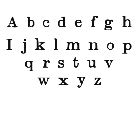
- Black Version:
Crafted with smooth, flowing, elegant letterforms, this high-contrast version features clear, rounded characters designed to reduce visual clutter. Its generous spacing and open counters promote effortless tracking, reducing visual fatigue during extended reading sessions—ideal for books, digital screens, signage, and everyday reading.
- Color Coded Version:
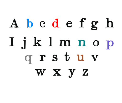
Incorporates a lively, vibrantly colored set of letters where b is in deep blue, d in bright red, p in rich purple, q in solid grey, n in teal, and u in warm brown. These colors instantly guide the eye, differentiate similar shapes, and support pattern recognition—making decoding quicker and more accurate.
2. Design Aesthetics for Engagement & Readability
The font features rounded, approachable letter shapes that feel friendly and inviting, reducing anxiety associated with reading challenges. Its flowing curves mimic natural handwriting, making it more relatable for children and engaging for all users.
3. Vibrant Color Assignments for Critical Letters
- b (blue): Represents trust and calm, making the letter easy to identify in lengthy texts.
- d (bright red): Captures attention, helping prevent reversals with b.
- p (purple): Supports creative thinking while aiding differentiation from q.
- q (grey): Neutral yet distinctive, supporting clarity without overwhelming visual processing.
- n (teal): Fresh and vibrant, supporting recognition in cursive or handwritten forms.
- u (brown): Grounded and earthy, distinguishing its shape from n and v.
These color choices support pattern recognition and reinforce phonemic awareness, leading to improved fluency.
4. Open, Friendly Shapes & Generous Spacing
The font maintains a balance of elegance and clarity—rounded strokes, open counters, and wide letter-spacing help reduce visual crowding, especially helpful for those with visual stress or attention challenges. Clear baseline alignment and consistent letterforms promote fluid tracking.
How Color Coding Supports Faster and Easier Reading
- Instant Differentiation:
Color cues help distinguish b from d, preventing common reversal errors—making reading more accurate and swift.
- Pattern Recognition:
Consistent color assignments support the recognition of spelling patterns, prefixes, suffixes, and root words, accelerating decoding.
- Memory Reinforcement:
Bright, specific colors act as mnemonics, reinforcing associations between the letter shape and its sound, leading to faster recall during reading.
- Cognitive Load Reduction:
By turning complex visual discrimination into straightforward perceptual cues, the font reduces mental effort, lessening fatigue and frustration.
- Enhanced Engagement & Confidence:
Vivid, colorful text stimulates interest, motivating learners and readers to spend more time reading and learning with greater confidence.
Practical Applications of Vivid Sense
Educational Use
In classrooms, the font can be incorporated into worksheets, reading apps, digital textbooks, and guided reading materials for early learners or remedial programs. Its bold, colorful differentiation encourages repeated practice and mastery.


Reviews
There are no reviews yet.