Read Ease Color Coded Font
(by Improve Dyslexia with Black Version and Color Coded Version)
Introducing Read Ease, a revolutionary font developed by Improve Dyslexia in partnership with acclaimed typeface designer Simon Blake. This innovative typeface is designed to make reading faster, easier, and more accurate for individuals with dyslexia, as well as supporting actors and performers in reading scripts. Available in a sleek, high-contrast Black Version and an engaging Color Coded Version, Read Ease harnesses the power of strategic color assignment combined with friendly letterforms to facilitate multisensory reading—accelerating decoding, reducing errors, and fostering confidence.
The Science Behind Color Coding in Fonts
Extensive research shows that pairing color with typography enhances recognition, pattern detection, and speed. For readers with dyslexia, the confusion between similar-looking letters such as b, d, p, and q is common. The Read Ease font addresses this challenge head-on by using vibrant, distinct colors for these problematic letters, allowing for immediate visual differentiation.
Color cues also reinforce phonemic patterns and word structures, helping readers internalize recognition patterns more quickly. They serve as visual anchors, reducing cognitive load and enabling users to read longer, with less fatigue and more enjoyment.
Features of Read Ease
1. Dual Version – Black and Color Coded
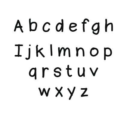
- Black Version:
Designed with clean, friendly, and highly legible letterforms, this version provides a simple, high-contrast option ideal for standard print, digital screens, signage, and everyday reading. Its open shapes and generous spacing reduce visual crowding, making it ideal for learners, educators, and public information.
- Color Coded Version:
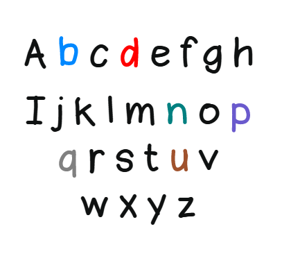
This dynamic version assigns specific colors to problematic letters—particularly b, d, p, q, n, and u—to aid differentiation and quick recognition. The vibrant hues (such as red, green, orange, blue, purple, and yellow) visually separate these frequently confused characters to prevent reversals and misreading. Color coding reinforces recognition of letter groups, dramatically speeding up decoding times.
2. Friendly, Rounded Letterforms
The font features rounded, approachable shapes that are inviting for children and adults alike. Its friendly style reduces intimidation and supports engagement, encouraging more frequent use.
3. Strategic Letter and Line Spacing
Enhanced spacing between letters and lines decreases visual crowding, a common barrier for dyslexic readers. The spacious design ensures each letter stands out clearly, helping the eye track smoothly and reducing errors.
4. Vibrant Color Assignments for Key Letters
- b, d, p, q:
These reversal-prone letters are assigned distinct, vibrant colors—e.g., b in blue, d in bright red, p in bold purple, and q in solid grey—to enhance their distinction and prevent confusion during reading and handwriting.
- n and u:
Similarly, n and u are color-coded in contrasting shades (e.g., n in teal, u in brown) to support their recognition, especially in cursive or handwritten styles.
- Vowels and consonants:
Vowels are highlighted in warm, bright colors like red or pink, while consonants use cooler shades such as blue or purple. This color strategy helps in phonemic awareness and decoding.
How Color Coding Boosts Reading Speed and Comprehension
- Immediate Letter Differentiation:
Vibrant, distinct colors help users instantly distinguish between similar letters, avoiding reversals and errors, especially b, d, p, and q.
- Pattern Recognition:
Color cues reinforce common spelling and phonetic patterns, letting users recognize whole word families more rapidly.
- Memory Reinforcement:
Color associations act as mnemonic anchors, aiding long-term recognition and retrieval, speeding up decoding during fluid reading.
- Reduced Cognitive Load:
The visual clarity and color cues decrease mental effort, enabling users to process longer texts with less fatigue.
- Increased Engagement:
Bright, vibrant colors make reading more stimulating and fun, encouraging more frequent and prolonged reading sessions.
Practical Applications and Uses
Educational Settings
Teachers and therapists can use the font in worksheets, reading books, digital platforms, and remedial programs. The color-coded letter distinctions help early learners and struggling readers differentiate challenging letters, accelerate decoding skills, and build confidence.
Digital Media and Publishing
Websites, e-books, and apps can harness the flexible digital version of Read Ease to provide accessible reading experiences tailored to individual needs. The vibrant colors ensure high contrast, making online content more inclusive and user-friendly.


Reviews
There are no reviews yet.