Your cart is currently empty!
Radiant Read Color Font
“Radiant Read Color Font” supports an inclusive future where everyone—regardless of learning style—can read, learn, and perform with confidence and joy.
Description
Radiant Read Color Font
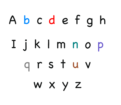
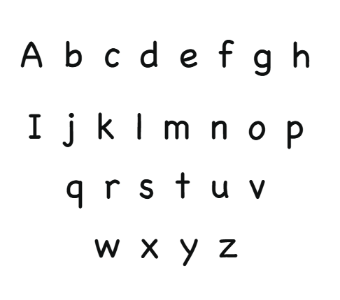
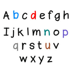
Introducing Radiant Read, an innovative and vibrant typeface created through the collaboration of EmotionNFT and the celebrated Simon Blake. This groundbreaking font is designed to enhance reading speed, comprehension, and confidence, especially for individuals with dyslexia, early learners, educators, and actors. Available in two formats—a crisp Black Version and a dynamic Color Coded Version—Radiant Read is built to turn reading into a multisensory journey, making decoding faster, clearer, and more engaging.
The Science and Power of Color Coding in Typography
Extensive research in neurodiverse literacy and multisensory learning has confirmed that color coding letters simplifies decoding and accelerates reading. When specific problematic letters are assigned vivid, contrasting colors, the brain receives immediate visual cues that support differentiation, pattern recognition, and quick identification—especially crucial for b, d, p, q, n, and u, which are frequently confused or reversed.
Color cues turn reading from a complex task into a straightforward process, particularly for learners with dyslexia. This multisensory approach connects visual, auditory, and kinesthetic pathways, reducing cognitive load, minimizing errors, and fostering fluency and confidence.
Features of Radiant Read
1. Dual Format for Versatile Use
- Black Version:
A sleek, high-contrast font featuring clean, rounded, and friendly letterforms. Its generous spacing and open counters promote effortless tracking and reduce visual fatigue, making it suitable for print, digital, signage, and general use. - Color Coded Version:
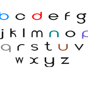
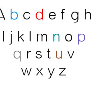
This vibrant version assigns specific colors to key letters, especially those that cause confusion, for instant differentiation:- b in blue
- d in bright red
- p in purple
- q in solid grey
- n in teal
- u in warm brown
These colors help prevent reversals and errors, dramatically speeding recognition and decoding.
2. Elegant, Vibrant Design Inspired by Light and Color
Radiant Read features flowing, smooth curves with a lively and energetic aesthetic. The gentle wave-like shapes and rounded strokes create visual harmony, supporting both aesthetics and functionality.
3. Vivid Color Assignments for Critical Letters
The strategic use of bright, contrasting colors for the most troublesome letters boosts differentiation:
- b (blue): Trustworthy and calming, ideal for beginner readers.
- d (bright red): Attention-grabbing; helps prevent reversal mistakes.
- p (purple): Creative and engaging, promotes letter recall.
- q (grey): Neutral yet distinct, reducing conflict with similar letters.
- n (teal): Bright and lively, aiding recognition in cursive forms.
- u (brown): Grounded and earthy, supporting differentiation from n.
This color system supports phonemic awareness, pattern recognition, and speedy decoding.
4. Open, Friendly Shapes and Spacious Layout
Generous spacing and open counters minimize visual crowding, crucial for dyslexic and attention-challenged readers. The rounded, approachable shapes support eye tracking and visual recognition, making long texts less daunting.
How Color Coding Accelerates Reading and Learning
Instant Differentiation:
Color cues provide immediate visual distinction between similar letters, effectively reducing reversal errors—b/d, p/q, and n/u—which are common hurdles for dyslexic readers.
Pattern Recognition:
Color assignments highlight common spelling patterns, enabling users to recognize word families and phonetic structures rapidly, boosting fluency.
Memory Reinforcement:
Colors act as mnemonic anchors, strengthening neural associations between shapes and sounds, leading to quicker recognition and automatic decoding.
Speech & Reading Fluency:
Accelerated decoding increases reading speed, improves comprehension, and encourages sustained focus—making reading less frustrating and more enjoyable.
Confidence Boost:
As recognition errors decrease, users develop confidence and motivation, fostering a positive attitude towards reading and learning.
Practical Applications for Radiant Read
Educational Use
Fundamentally supportive for classroom learning, the font can be incorporated into worksheets, digital reading apps, and early literacy programs for students across all ages. Its vibrant, multisensory design supports phonics instruction, pattern recognition, and reading fluency—boosting engagement and confidence.
Digital Content & Publishing
Ideal for ebooks, websites, and digital tools, Radiant Read offers accessible content that fosters longer engagement and improved comprehension. Its vibrant color coding aids online learning environments, making content more accessible and inviting for readers with diverse needs.
Public Signage and Community Communication
The Black Version excels in high-contrast signage, labels, and information displays, ensuring critical messages are clear and easily understood. Its simple, friendly design makes it suitable for public spaces, hospitals, airports, and community centers committed to inclusivity.
Scripts and Performing Arts
One of the most innovative applications of Radiant Read lies in acting and theatrical script reading. Scripts densely packed with dialogue and cues can be overwhelming, especially for performers with dyslexia or learning differences. The Color Coded Version offers a solution:
- Faster Line Learning:
Color-coded lines help actors recognize character-specific dialogue, cues, and emotional notes instantly, minimizing rehearsal time and mistakes. - Character & Cue Differentiation:
Themes, expressions, or stage directions can be highlighted in distinct colors, assisting actors in quickly tailoring their delivery and maintaining stage flow. - Stage Confidence & Delivery:
When lines and cues are visually distinct, actors gain confidence, deliver lines more fluidly, and respond to cues with better timing and emotional authenticity. - Rehearsal Efficiency:
Speeding up memorization and cue recognition reduces rehearsal hours and stage anxiety, contributing to polished performances.
The Future of Inclusive Typography with Radiant Read
“Radiant Read” exemplifies how thoughtful, multisensory design can support diverse audiences—whether aiding children in early literacy, supporting adults in digital reading, or empowering actors on stage. Its vibrant lettering, combined with tiered design support, paves the way for more inclusive, engaging communication.
As digital tools allow for customization—changing colors, sizes, spacing—users can personalize their reading environments further, making “Radiant Read” adaptable to individual needs. This fosters a culture of accessibility and helps turn reading into a joyful, confident experience for all.
Conclusion
“Radiant Read” by Improve Dyslexia, designed by Simon Blake, is more than a font—it’s a multisensory connector that transforms the reading and acting experience. Its vibrant assignment of**
- b (blue),
- d (bright red),
- p (purple),
- q (grey),
- n (teal),
- u (brown),
turns confusing, reversal-prone letters into instantly recognizable visual anchors, dramatically boosting decoding speed and accuracy. Whether in primary schools, digital content, signage, or the stage, “Radiant Read” supports an inclusive future where everyone—regardless of learning style—can read, learn, and perform with confidence and joy.
This font embodies the potential of visual design to break barriers, foster belonging, and ignite a love for reading and the performing arts across all ages and abilities.
Related products
-
BrightMind Color Font
$7.99Original price was: $7.99.$2.99Current price is: $2.99. -
Vivid Sense Color Font
$6.99Original price was: $6.99.$2.99Current price is: $2.99. -
Read Ease Color Coded Font
$6.99Original price was: $6.99.$2.99Current price is: $2.99. -
Dyslexia Topt Color Coded Font
$5.99Original price was: $5.99.$2.99Current price is: $2.99. -
Dyslexia Light Color Coded Font
$7.99Original price was: $7.99.$2.99Current price is: $2.99.
Reviews
There are no reviews yet.