Lumina Read Color Font
Introducing Lumina Read, a visually vibrant and scientifically crafted typeface developed through a collaboration between EmotionNFT and the esteemed Simon Blake. This innovative font aims to revolutionize the reading experience for individuals with dyslexia, early learners, educators, and actors. Available in both a crisp Black Version and an engaging Color Coded Version, Lumina Read supports faster, clearer, and more confident reading—turning text into a multisensory, accessible experience that minimizes confusion and boosts comprehension.
The Power of Color Coding in Typography
Extensive research and practical application support the use of color coding to improve reading fluency and accuracy. When specific, challenging letters—such as b, d, p, q, n, and u—are highlighted in distinctive, vibrant colors, the brain receives immediate visual cues that prevent reversal errors and support pattern recognition. This multisensory approach—combining shape, color, and spacing—activates multiple neural pathways, making decoding faster, more accurate, and less mentally taxing.
Color coding also guides recognition in noisy or complex reading environments, assists in differentiating similar letterforms, and creates a visual map that helps the reader process words quickly and effortlessly. The result: increased reading speed, comprehension, confidence, and sustained engagement.
Features of Lumina Read
1. Dual Format for Maximum Flexibility
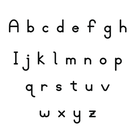
- Black Version:
Crafted with high-contrast, clean, and rounded letterforms, this version emphasizes clarity and readability. Its generous spacing and open counters help prevent visual crowding, reducing eye fatigue in print and digital formats, making it suitable for early readers, adults, and public signage.
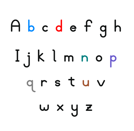
- Color Coded Version:
Each of the problematic letters—b, d, p, q, n, u—is assigned a distinctive, vibrant color to support recognition:
- b in blue (trust, clarity)
- d in bright red (attention, differentiation)
- p in purple (creativity, emphasis)
- q in solid grey (neutral, unobtrusive)
- n in teal (refreshing, distinctive)
- u in brown (grounding, stable)
This color palette allows users to instantly differentiate these letters, crucial for decoding accuracy.
2. Elegant, Playful Letterforms with Visual Flow
Lumina Read features rounded, approachable, and flowing letter shapes inspired by gentle light waves, giving it a friendly, engaging feel. This aesthetic tool supports not only readability but also aesthetic appeal, fostering a positive emotional response to reading.
3. Strategic Use of Vibrant Colors for Differentiation
Applying high-contrast, vivid colors to critical letters greatly enhances visual recognition:
- b (blue): calming, trustworthy signal
- d (bright red): attention-grabbing, emphasizes difference from b
- p (purple): promotes creativity and distinguishes from q
- q (grey): neutral and non-distracting support
- n (teal): vibrant and distinctive for quick recognition
- u (brown): grounding, to prevent confusion with n
These visual cues act as navigation aids, streamlining decoding and accelerating reading fluency.
4. Open, Friendly Shapes and Generous Spacing
The font employs open counters and wide kerning, minimizing visual clutter and crowding—an essential factor for dyslexic readers who struggle with closely packed text. The wide, flowing strokes support smooth eye tracking, making reading longer texts more comfortable and less fatiguing.
How Color Coding Accelerates and Simplifies Reading
- Immediate Letter Discrimination:
Color cues instantly differentiate similar-looking letters, such as b and d, p and q—which are often reversed or misread—enhancing accuracy during decoding.
- Pattern and Word Recognition:
Color highlighting emphasizes common spelling and phonetic patterns, supporting recognition of common root words, prefixes, and suffixes, leading to faster reading.
- Memory and Recall:
Colors serve as mnemonic anchors, reinforcing connections between visual shape, sound, and meaning, which improves long-term recall and decoding speed.
- Reducing Cognitive Load:
Decoding becomes more automatic with visual differentiation, freeing mental resources for comprehension, inference, and vocabulary building.
- Boosting Confidence:
Faster decoding with fewer errors bolsters confidence, encourages more reading engagement, and fosters a positive attitude toward reading and learning.


Reviews
There are no reviews yet.