Your cart is currently empty!
Sale!
Dyslexia Liberation Serif Color Font
Original price was: $5.99.$2.99Current price is: $2.99.
This Dyslexia Liberation Serif Color Font combines the timeless traditional serif fonts with thoughtful modifications and innovative use of color coding.
Description
Dyslexia Liberation Serif Family Color Font by Simon Blake
The Dyslexia Liberation Serif Family Color Font, designed by Simon Blake, represents a groundbreaking advancement in accessible typography tailored specifically for individuals with dyslexia. This innovative font family combines the timeless elegance of traditional serif fonts with thoughtful modifications and the innovative use of color coding, aimed at improving reading fluency, comprehension, and confidence among dyslexic readers.
Introduction to the Dyslexia Liberation Serif Family
The Dyslexia Liberation Serif font family is a meticulously crafted typeface series that balances aesthetic appeal with functional design principles rooted in cognitive science. Serif fonts, traditionally known for their readability in print, are adapted here to meet the needs of a neurodiverse audience, emphasizing clarity, differentiation, and comfort. The font family includes multiple weights and styles, empowering users with versatile options for digital and print media—ranging from body text to headings, ensuring a consistent and accessible reading experience.
One of the defining features of this font family is its integration of color, which serves as a visual aid designed explicitly to reduce the common reading errors experienced by individuals with dyslexia. Simon Blake, leveraging his expertise in typography and neurodiverse needs, incorporates color coding to enhance letter recognition, reduce crowding, and support visual discrimination.
Key Features and Design Principles
1. Enhanced Letter Differentiation through Distinctive Shapes
The Dyslexia Liberation Serif Family employs subtly altered letter shapes to prevent common confusions, such as “b,” “d,” “p,” and “q,” which are frequently problematic for dyslexic readers. The serifs are carefully designed to provide directional cues, enabling the eye to trace the text more efficiently and reducing visual crowding.
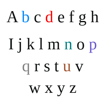
2. Use of Color Coding to Aid Reading
Perhaps the most innovative aspect of this font family is its strategic use of color. Each letter or group of letters is color-coded to support recognition and reduce errors during reading. For example, the font may assign specific colors to vowels, consonants, or frequently confused letter groups (like “m” and “n” or “u” and “v”). By visually segmenting text through color, readers can more quickly identify and differentiate letter patterns, leading to faster decoding and comprehension.
Color coding acts as a cognitive scaffold—similar to teaching methods in special education—that guides the visual processing system. It helps reduce the effort needed to decode words, decreasing fatigue and frustration. The color assignments are carefully chosen to be visually comfortable, avoiding overly bright or harsh contrasts that could cause distraction or discomfort.
3. Optimized Spacing and Letterform Adjustments
The font reduces letter crowding through increased letter spacing and carefully crafted letterforms that are simple yet distinctive. The serifs aid the eye in tracking along lines of text, and the open counters within letters (the open space inside characters such as “o” and “e”) make letter recognition easier and faster.
4. Text Background and Color Combinations
The font family doesn’t only include colored letters but also provides guidance on effective background and text color combinations. For example, black letters on a pastel background or white on a colored background can significantly increase contrast and readability for users with dyslexia. The color coding is also designed to work harmoniously with various background colors to maximize visual comfort.
How Color Coding Enhances Reading Capabilities
One of the central innovations of the Dyslexia Liberation Serif family is how it leverages the power of color to address the core challenges faced by dyslexic readers. Here are some ways this enhances reading:
- Letter Discrimination: By assigning specific colors to certain letter groups, the font helps readers distinguish between characters that might otherwise be confused due to visual similarity or crowding effects. This reduces the misreading of words and enhances decoding speed.
- Memory and Recall: Color associations help reinforce letter and word recognition. The neurocognitive process benefits from multisensory cues, whereby the visual color reinforces the shape of the letter, aiding memory retention and recall in reading tasks.
- Focus and Engagement: Bright, appealing colors can make reading more engaging and less daunting. This psychological boost can encourage more frequent reading and practice, leading to improved literacy over time.
- Reduction of Visual Stress: Color coding can decrease visual stress by breaking the monotonous sea of black and white text, ultimately reducing fatigue and discomfort, which are common barriers for dyslexic readers.
- Facilitation of Fluent Reading: When letter recognition becomes easier through color cues, fluency improves, leading to more natural reading rhythm and comprehension.
Practical Applications and Usage
The Dyslexia Liberation Serif Family is adaptable across various platforms and media. It can be used in digital applications, e-learning platforms, printed books, and signage, providing a consistent, accessible reading experience.
About The Author:
Related products
-
Color Wave Font
Original price was: $6.99.$2.99Current price is: $2.99. -
Clear Read Color Coded Font
Original price was: $7.99.$2.99Current price is: $2.99. -
Dyslexia Bubble Color Coded Font
Original price was: $7.99.$2.99Current price is: $2.99. -
Dyslexia Topt Color Coded Font
Original price was: $5.99.$2.99Current price is: $2.99. -
Dyslexia Crufty Color Font with Black Version
Original price was: $6.99.$2.99Current price is: $2.99.


Reviews
There are no reviews yet.