BrightLine Typeface Color Font
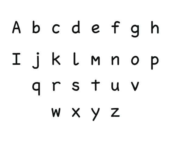
Introducing BrightLine, an innovative and dynamic typeface developed through a collaboration between EmotionNFT and the celebrated Simon Blake. Designed to foster speed, clarity, and confidence in reading, BrightLine combines sleek, modern aesthetics with potent color coding to support individuals with dyslexia, early learners, educators, and even actors reading scripts. This font is available in two formats: a crisp, high-contrast Black Version suited for everyday printing and digital displays, and a vibrant Color Coded Version that employs strategic hues to facilitate differentiation, pattern recognition, and rapid decoding.
The Power of Color Coding in Typography
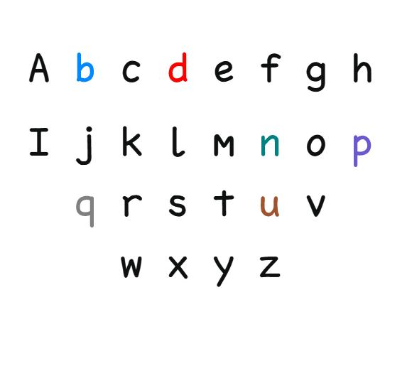
Research evidence and practical experience have consistently demonstrated that color coding letters significantly accelerates reading fluency, reduces errors, and increases comprehension for readers of all ages—most notably those with dyslexia. When problematic letters like b, d, p, q, n, and u are highlighted with vivid, distinct colors, the brain is able to instantly differentiate and recognize these characters, preventing common reversals and confusion. The Color Coded Version of BrightLine leverages this multisensory approach to make reading not just faster, but more intuitive and enjoyable.
Color cues create an additional layer of processing, acting as quick visual anchors that guide the eye and help the reader differentiate between similar shapes. This reduces processing time, minimizes mistakes, and develops deeper pattern recognition, ultimately supporting quicker, more confident reading.
Features of the BrightLine Typeface
1. Dual Format: Flexibility for All Needs
2. Distinctive, Friendly Letterforms
The font’s rounded, approachable shapes and open counters create a welcoming visual environment. The simple, modern style prevents visual overload, making it ideal for early literacy, remedial programs, and digital content.
3. Strategic Use of Color for Speed and Accuracy
Color assignments are not arbitrary—they’re grounded in research and designed to create immediate visual cues:
- Correct differentiation: The vibrant colors help differentiate b (blue) from d (red), p (purple) from q (grey), and so forth, cutting reversals and confusion.
- Pattern reinforcement: Recognizing familiar colored letter groups accelerates decoding of words and increases fluency.
- Mnemonic support: The color associations aid memory retention and recall, which speeds up reading and comprehension.
4. Optimized Spacing and Flow
Wide spacing and open counters support seamless eye tracking, making longer texts less taxing and boosting fluency. The flowing strokes help the eye move smoothly from one word to the next, supporting sustained reading and focus.
How Color Coding Supports Faster & Easier Reading
Immediate Differentiation:
Color cues instantly clarify the identity of difficult letters, especially b/d, p/q, and n/u. This prevents common reversal errors and quickens recognition.
Pattern Recognition & Fluency:
Color highlights reinforce spelling patterns, enabling users to recognize familiar word families faster, leading to more fluid reading.
Memory and Recall:
Color associations serve as visual mnemonics that strengthen understanding of letter sounds and patterns, making decoding quicker and more reliable.
Reduced Cognitive Load:
Clarity and differentiation reduce the mental effort needed to decode words, freeing capacity for comprehension and enjoyment.
Enhanced Engagement:
Vivid, colorful fonts stimulate interest and motivation, transforming reading into an engaging activity, especially for children or reluctant readers.
Practical Applications
Educational Use
Teachers and therapists can incorporate BrightLine into reading exercises, digital tools, and classroom materials to support early literacy development, remedial reading, and inclusive education.
Digital & Publishing
The Color Coded Version works seamlessly in ebooks, online platforms, educational apps, and media content. Its vibrant hues make reading online more engaging and accessible.
Signage & Public Information
The Black Version offers excellent clarity in signage, labels, and public signs, ensuring vital information is clearly communicated to audiences of all ages and visual abilities. Its high contrast and simple letterforms support quick comprehension in busy environments.


Reviews
There are no reviews yet.