Bright Script Color Font
Introducing the Bright Script Color Font, a vibrant and innovative typeface crafted through a collaboration between Improve Dyslexia and renowned typeface designer Simon Blake. This expressive font combines the elegance of script-style calligraphy with the powerful support of color coding, designed to make reading faster, easier, and more confident—especially for individuals with dyslexia, students, educators, and actors.
Available in two versatile formats—a sleek Black Version suited for everyday print and digital use, and an engaging Color Coded Version that leverages a carefully curated palette to facilitate multisensory recognition—the Bright Script Color Font aims to transform reading into an enjoyable, engaging experience.
The Science and Power of Color Coding in Fonts
Research has shown that color coding letters dramatically enhances reading fluency, accuracy, and confidence. When specific problem letters—most notably those prone to confusion or reversal—are assigned distinctive, vibrant colors, the brain receives multisensory cues that facilitate differentiation, pattern recognition, and speed. For example, the frequently confused b and d can be instantly distinguished when b is in blue and d is in bright red.
Color cues also reinforce phonetic and orthographic patterns, helping learners and performers recognize word structures faster. This multisensory approach minimizes the cognitive load, reduces errors, and accelerates decoding—leading to confident, fluent reading.
Features of Bright Script Design
1. Dual Format for Flexibility
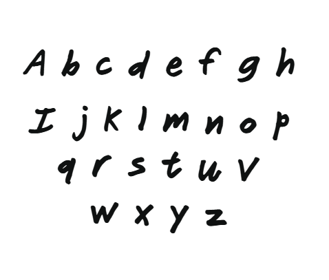
- Black Version:
This sleek, high-contrast script font features elegant, flowing letterforms designed for clarity and sophistication. It’s ideal for formal documents, educational materials, signage, and digital use where high readability is paramount. Rounded, open forms and generous spacing ensure ease of tracking, reducing visual fatigue.
- Color Coded Version:
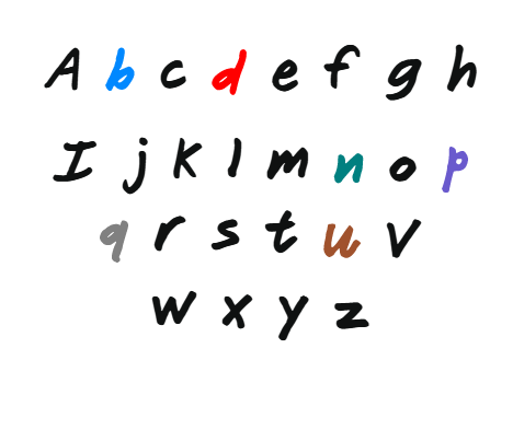
This dynamic variant employs a vibrant color palette to highlight key letter groups, especially those that are often confused, presenting them in distinct, easy-to-spot hues:
- b in blue
- d in bright red
- p in purple
- q in solid grey
- n in teal
- u in brown
This strategic color assignment helps users differentiate similar shapes immediately and decode more rapidly.
2. Elegant, Flowing Script Style
Inspired by classic calligraphy, the Bright Script features graceful curves, fluid strokes, and a friendly aesthetic that appeals to children and adults alike. The flowing form invites engagement and makes reading aesthetically pleasing.
3. Vibrant Color Patterns for Clear Differentiation
Assigning bright, contrasting colors to problematic letters creates instant visual cues:
- b is in calming blue, evoking trust and clarity.
- d in bright red captures attention and reduces reversals.
- p in deep purple supports visual recognition of the lower loop.
- q in solid grey minimizes confusion with similar letters.
- n in lively teal enhances letter shape distinction.
- u in rich brown is grounding, ensuring easy differentiation from n.
This color system supports pattern recognition, phonetic reinforcement, and quick differentiation, all crucial for speedy decoding.
4. Open, Friendly Letterforms and Ample Spacing
The font’s character shapes are designed with soft, rounded curves and open counters, reducing visual crowding—one of the main barriers for dyslexic readers. Wide spacing between letters and words further supports fluent tracking and minimizes confusion across lines.
How Color Coding Enhances Reading and Learning
Faster Recognition:
Color differentiation instantly signals to visual and cognitive processing systems to distinguish problematic letters, greatly speeding recognition and reading fluency.
Pattern and Word Recognition:
Color cues reinforce recognition of common phonetic patterns, enabling more rapid decoding of unfamiliar words and boosting vocabulary acquisition.
Memory and Recall:
Colors act as mnemonic anchors, strengthening mental connections between letter forms and sounds, which accelerates fluency and comprehension.
Cognitive Load Reduction:
Visual differentiation decreases mental effort, allowing readers to process longer texts without strain—or fatigue—thus supporting sustained reading and learning.
Increased Engagement and Confidence:
Vivid, colorful text makes reading more fun and stimulating, boosting motivation, especially among reluctant or struggling readers.
Practical Applications
Educational Settings
Teachers and therapists can incorporate Bright Script into worksheets, digital content, and classroom materials to promote multisensory learning. Its friendly, script style combined with color cues supports early literacy, remedial reading, and inclusive classroom environments. The vibrant visual differentiation helps struggling learners recognize and decode words more quickly, fostering confidence and independence.


Reviews
There are no reviews yet.