Your cart is currently empty!
In an era where inclusivity in education and communication is paramount, innovative font designs are playing a crucial role in enhancing readability for dyslexic individuals. Simon Blake is at the forefront of this movement, striving to break down the barriers that traditional typography often poses for dyslexic readers.
Through thoughtful design and a deep understanding of the reading challenges faced by these individuals, Blake’s font innovations offer a blend of aesthetic appeal and practical functionality, making significant strides toward more inclusive typography.
Understanding Dyslexia and Typography Dyslexia is a common learning difference that affects a person’s ability to read, spell, and write. It is not linked to intelligence but rather to how the brain processes written language. For dyslexic readers, standard fonts can often blend letters together, making reading a strenuous and frustrating task.
The Challenge
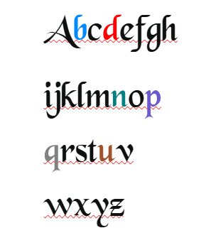
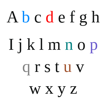
This challenge has long driven designers to seek solutions that can aid in making reading more accessible. Key Features of Innovative Dyslexia-Friendly Fonts Simon Blake’s work in designing dyslexia-friendly fonts focuses on addressing the unique needs of dyslexic readers through specific design features: Distinctive Letter Shapes: Blake’s fonts emphasize unique letterforms, reducing confusion between similar-looking letters such as “b” and “d” or “p” and “q.” By adjusting the shapes and angles, these fonts minimize the risk of letter reversals and enhance letter differentiation.
Increased Spacing: By incorporating generous spacing between letters, words, and lines, Blake’s fonts help reduce visual crowding. This spacing minimizes the blending of characters, allowing each letter to stand out more clearly, which aids in improving reading fluency. Open Counters and Clear Baselines: Open counters in letters like “o” and “e” improve readability by ensuring that the shapes are easily recognizable.
Additionally, consistent and clear baselines help guide the reader’s eye smoothly across the text, reducing errors and increasing speed. Use of Color Coding: A distinctive feature of Blake’s dyslexia-friendly fonts is the integration of color coding.
By associating specific colors with certain letter groups, readers can more easily distinguish between similar characters and enhance memory retention. This multisensory approach taps into visual processing strengths, aiding in faster decoding and comprehension.
Simplified and Consistent Design
Simplification of unnecessary flourishes and consistent styling across the entire font set ensures that dyslexic readers are not distracted by ornamental details, allowing them to focus on the content. The Impact of Dyslexia-Friendly Fonts Simon Blake’s innovative fonts have demonstrated a marked improvement in reading performance for dyslexic individuals.
Here are a few ways these designs make a positive impact: Improved Reading Speed and Accuracy: The distinctive, colorful design features help dyslexic readers identify letters more quickly and accurately, reducing reading time and increasing comprehension.
Enhanced Confidence and Enjoyment: By making text easier to process, these fonts reduce frustration, allowing readers to engage with content more enjoyably and confidently.
Broader Educational Opportunities: Accessible reading materials enable dyslexic individuals to participate fully in educational settings, opening doors to further learning and personal development.
Encouraging Wider Adoption For a true culture shift, it is essential to integrate dyslexia-friendly fonts into various media and educational resources. Blake’s advocacy goes beyond design; he pushes for increased awareness and adoption in schools, digital media, and publishing industries.
By championing these fonts, Blake hopes to inspire other designers to prioritize accessibility in their typographic endeavors. Conclusion Simon Blake’s innovative font designs represent a significant progression in creating inclusive reading experiences for dyslexic individuals.
By addressing specific challenges through carefully considered design elements and leveraging the power of color, these fonts pave the way for more accessible and enjoyable reading. As awareness and appreciation of such needs grow, these innovations will likely become a standard in creating educational and professional environments where everyone can succeed.
Through ongoing research, collaboration, and creativity, designers like Simon Blake continue to redefine how typography can serve as a tool for empowerment and inclusivity, ensuring that all readers, regardless of their abilities, have the opportunity to engage with and enjoy the written word.
The Impact of Blake’s Innovations
The practical effects of Simon Blake’s fonts are profound and multifaceted:
- Enhanced Reading Speed and Accuracy:
The unique letterform configurations, combined with color cues, make it easier for dyslexic readers to recognize characters swiftly and correctly. This leads to faster decoding, less frustration, and improved comprehension. - Increased Confidence and Motivation:
When reading becomes easier and more successful, users experience less anxiety and greater motivation. Over time, this boosts self-esteem and encourages more independent reading, fostering a positive cycle of learning and engagement. - Broader Educational Opportunities:
Schools and educators adopting Blake’s fonts can better support dyslexic students by providing accessible reading materials. This inclusivity translates into more active participation, improved literacy skills, and increased academic achievement. - Better Digital and Print Accessibility:
Blake’s font designs are adaptable for digital screens, e-books, websites, and print materials, ensuring that dyslexic-friendly features are incorporated across various media. This versatility helps create an inclusive environment where accessible content is the norm rather than the exception.
Promoting Wider Adoption and Cultural Shift
Blake’s advocacy extends beyond designing fonts; he actively campaigns for greater awareness and adoption of dyslexia-friendly typography in education, publishing, and public communication. He emphasizes that inclusive typography shouldn’t be an afterthought but an integral part of content creation. To foster a lasting cultural shift, Blake encourages schools, publishers, designers, and policymakers to prioritize accessibility and to recognize the profound impact font choice can have on literacy and confidence.
He also advocates for technological solutions that allow personalized adjustments—such as color schemes, spacing, and font size—to cater to individual preferences and sensitivities. Digital platforms enable users to customize reading environments, making typefaces not just accessible but also adaptable.
Future Directions: Innovation and Research
Simon Blake’s work exemplifies the synergy between design and science. Ongoing research into neurodiversity, cognitive load, and visual processing continues to inform new approaches. Innovations such as dynamic, customizable fonts that adapt in real-time to user needs, or applications that combine font design with augmented reality, are on the horizon.
Furthermore, collaborative efforts between typographers, neuroscientists, educators, and technologists promise to push the boundaries of inclusive design. Blake’s vision encourages continuous refinement, ensuring that typography evolves as a powerful tool in promoting literacy and inclusion across all contexts.
Final Thoughts
In an increasingly digital and interconnected world, the importance of accessible typography cannot be overstated. Simon Blake’s pioneering fonts exemplify how thoughtful, science-informed design can dramatically improve reading experiences for dyslexic individuals. His work demonstrates that innovation in font design is not merely an aesthetic pursuit but a vital component of social equity.
By addressing specific challenges—letter recognition, spacing, color differentiation—and leveraging multisensory cues, Blake’s fonts help eliminate barriers and open doors to understanding, learning, and growth. As awareness grows and technology advances, adopting such inclusive typography principles will become essential in creating a society where everyone has equal opportunity to engage with the written word — confidently, comfortably, and joyfully.
Call to Action
Whether you are an educator, designer, publisher, or developer, consider how your choices in typography influence accessibility and inclusion. Embrace innovative fonts like those developed by Simon Blake, and advocate for broader adoption of accessible design principles. Together, we can create a future where reading is a universal right — not limited by neurodiversity, but enriched by understanding and thoughtful design.
Copyright 2025 Simon Blake
Innovative Font Designs for Dyslexic Readers
In an era where inclusivity in education and communication is paramount, innovative font designs are playing a crucial role in enhancing readability for dyslexic individuals. Simon Blake is at the forefront of this movement, striving to break down the barriers that traditional typography often poses for dyslexic readers.
Leave a Reply