BrightMind Color Font
Introducing BrightMind, a revolutionary typeface co-created by EmotionNFT and the talented Simon Blake. This font is designed to unlock the full potential of visual processing, making reading faster, clearer, and more confident—especially for individuals with dyslexia, early learners, educators, and performers. Available in two impactful formats — a sleek Black Version for optimal contrast and everyday use, and a vivid Color Coded Version that employs strategic color assignments to emphasize differentiation and support multisensory learning — BrightMind champions an inclusive, vibrant approach to literacy and performance.
The Science and Effectiveness of Color Coding in Typography
Research in neurodiversity, literacy development, and multisensory learning shows that color coding letters supports faster decoding, reduces errors, and enhances retention. When challenging letters—particularly those prone to reversal or confusion, such as b, d, p, q, n, u—are highlighted in vibrant, distinct colors, the brain can instantly distinguish similar shapes, breaking down visual and cognitive barriers.
This multisensory approach turns reading into an intuitive process, activating multiple neural pathways and minimizing cognitive overload. It’s especially beneficial for dyslexic readers, students acquiring literacy skills, and even actors working with scripts. Color cues provide immediate visual anchors, letting users decode words with speed and accuracy, boosting confidence and engagement.
Key Features of BrightMind
1. Dual Format for Versatile Usage
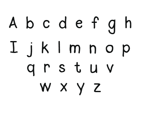
- Black Version:
Features clean, high-contrast letterforms with smooth curves and generous spacing, designed to minimize visual clutter and facilitate effortless reading. Its simple, elegant style is ideal for print content, digital screens, signage, and professional documents.
- Color Coded Version:
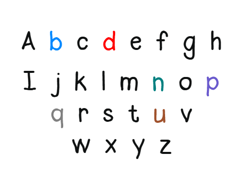
Utilizes vibrant, carefully selected colors to enhance differentiation and pattern recognition. Assigned colors are as follows:
- b in blue — calming, trustworthy
- d in bright red — attention-grabbing, distinguishes from b
- p in purple — creative and prominent
- q in solid grey — unobtrusive, neutral
- n in teal — vibrant and distinctive
- u in brown — stable, grounding
This color system instantly clarifies shape reversals and confusions, supporting rapid decoding.
2. Elegant, Friendly Letterforms
The font combines rounded, approachable strokes inspired by fluid, flowing shapes, which foster a welcoming reading experience. The gentle curves help reduce visual stress and support tracking over long texts.
3. Use of Color for Differentiation and Pattern Reinforcement
Color assignments are based on cognitive science principles:
- The b (blue) helps anchor recognition and confidence.
- The d (red) supports quick differentiation from b.
- The p (purple) visually stands out to aid retention.
- The q (grey) offers neutral clarity.
- The n (teal) provides a sharp contrast with u for recognition.
- The u (brown) grounds recognition, preventing confusion with n or v.
These visual cues help users recognize, compare, and decode words they encounter.
4. Open+Spaced Layout for Reduced Visual Crowding
Wide spacing and open counters support seamless tracking, reducing visual overload in densely packed or lengthy texts. This design encourages longer reading sessions with less fatigue.
How Color Coding Enhances Speed and Comprehension
1. Differentiation of Confusing Letters:
Color cues instantly clarify shape reversals like b/d or p/q, decreasing errors and increasing decoding speed.
2. Recognizing Patterns and Word Families:
Associating specific colors with common prefixes, suffixes, and roots accelerates pattern recognition, making familiar words easier to recognize in unfamiliar contexts.
3. Mnemonic Memory Anchors:
Colors act as visual mnemonics—strengthening the neural connection between shape and sound, speeding recognition during fluent reading.
4. Lower Cognitive Load:
Sharp visual distinctions cut down decoding effort, freeing mental resources for understanding content, and lessen fatigue during extended reading.
5. Increased Motivation and Confidence:
Bright, colorful letters make reading more engaging for children and adults, encouraging repeated practice and boosting self-esteem.
Practical Applications
Educational Settings
Teachers and therapists can incorporate BrightMind into worksheets, digital e-books, and literacy programs. Its engaging color cues foster early literacy and remedial reading


Reviews
There are no reviews yet.