Color Wave Font
Introducing the Color Wave Font, a visually dynamic and functionally innovative typeface designed by Improve Dyslexia in collaboration with celebrated typeface designer Simon Blake. This captivating font combines aesthetic creativity with practical support, making reading faster, easier, and more engaging—especially for learners with dyslexia, educators, and performers.
The Color Wave Font is available in two powerful formats: a sleek Black Version tailored for everyday print and digital use, and an exciting Color Coded Version that leverages the strategic use of vibrant colors to support decoding, pattern recognition, and confident reading.
The Power of Color Coding in Typography
Extensive research confirms that color coding letters significantly boosts reading speed, reduces errors, and sustains engagement. For individuals with dyslexia, letters such as b, d, p, q, n, u—which are frequently confused or reversed—are made more distinguishable through distinct, bright colors, greatly enhancing their recognition and differentiation. When the brain associates colors with specific letters, decoding becomes almost automatic, drastically improving fluency and comprehension.
Color cues also serve as multisensory anchors, reinforcing phonetic and orthographic patterns, and making it easier for learners and actors alike to process large amounts of text quickly and accurately. The visual distinction reduces cognitive load and mental fatigue, enabling longer reading sessions and more confident script memorization.
Features of the Color Wave Font
1. Dual Format for Flexibility and Inclusivity
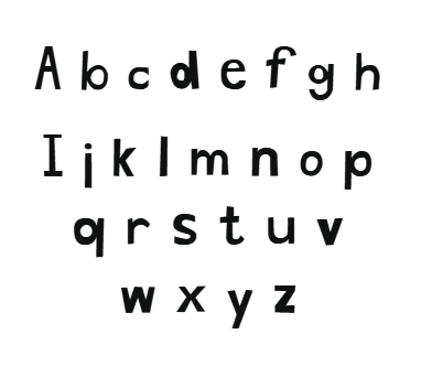
- Black Version:
The sleek, high-contrast design offers clean, flowing letterforms with gentle wave-like curves to create a visually appealing, smooth reading experience. Its generous spacing, open counters, and soft serif-like accents foster clarity and reduce visual clutter, making it ideal for everyday reading, digital platforms, signage, and print.
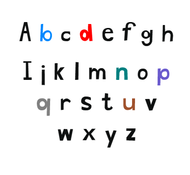
- Color Coded Version:
This vibrant version assigns specific, easy-to-distinguish colors to six key letter types, especially those prone to confusion:
- b in vivid blue
- d in bright red
- p in rich purple
- q in solid grey
- n in teal
- u in warm brown
These color assignments help readers instantly differentiate among similar or reversed letters, accelerating recognition and speed.
2. Design Aesthetics — The Flowing Wave
Inspired by the movement of water and the seamless flow of reading, the font’s letterforms feature gentle wave-like curves, rounded edges, and smooth connections that visually guide the eye across lines. This helps reduce visual fatigue and supports fluent tracking from start to finish of a line.
3. Vibrant Color Patterns for Differentiation and Pattern Recognition
Using bright, contrasting colors for the most confusing letters turns reading into a multisensory experience:
- b = blue (calm, reliable)
- d = bright red (urgent, attention-grabbing)
- p = purple (creative, learning-friendly)
- q = grey (neutral, balancing)
- n = teal (fresh, vibrant)
- u = brown (earthy, grounded)
This visual system helps detect, differentiate, and memorize key letter forms faster, especially in unfamiliar text.
4. Open and Friendly Letterforms
The font emphasizes open counters and rounded forms that eliminate sharp corners, making characters easier to identify in long reading sessions. Its flowing, wave-inspired design is inviting and reduces visual confusion, supporting both children and adults in decoding text with less effort.
5. Strategic Spacing and Clear Baseline
Large, generous spacing between letters and around words supports easy tracking, while a consistent baseline ensures smooth eye movement. This reduces the risk of skipping or misreading words, boosting overall fluency.
How Color Coding Accelerates Reading and Learning
- Enhanced Differentiation:
Color helps distinguish b, d, p, q instantly, preventing reversals and errors that slow reading.
- Pattern Recognition:
Color cues reinforce common phonetic patterns, enabling users to recognize word groups and spelling rules faster.
- Mnemonic Memory Aids:
Colors serve as mnemonic anchors, strengthening mental connections between letter shapes and sounds, leading to quicker recall.
- Reduced Cognitive Load:
By simplifying decoding, color coding frees mental resources, allowing users to focus on comprehension and enjoyment.
- Increased Engagement:
Bright, colorful text is stimulating and motivating, encouraging repeated reading and active learning.
Practical Uses
Educational Support
Teachers and therapists can incorporate Color Wave into worksheets, digital apps, and reading programs to support early literacy, remedial education, and inclusive classrooms. The color cues help children differentiate tricky letters, develop decoding skills, and build confidence in reading.


Reviews
There are no reviews yet.