“Vivid Letters Color Coded Font”
(by Improve Dyslexia with Black Version and Color Coded Version)
Introducing Vivid Letters, an innovative typeface developed by Improve Dyslexia in collaboration with renowned typeface designer Simon Blake. This extraordinary font merges playful, eye-catching design with scientifically-backed color coding techniques to support faster, easier, and more confident reading. Available in both a sleek Black Version and a vibrant Color Coded Version, Vivid Letters is crafted to serve a broad spectrum of users—children learning to read, students with dyslexia, educators, and actors reading scripts—empowering them to unlock the full potential of written language.
Why Color Coding Enhances Reading
Research has shown that color coding letters and words significantly improves reading fluency, comprehension, and retention—especially for those with dyslexia. When the brain associates specific colors with letter groups, sounds, or patterns, it creates multisensory cues that accelerate recognition and reduce confusion. These cues serve as visual anchors that help differentiate similar letters, unlock decoding processes, and foster automatic word recognition. The result: faster reading, fewer errors, and greater confidence.
Features of Vivid Letters
1. Dual Versions for Maximum Flexibility
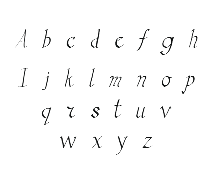
- Black Version: Designed with bold, rounded, and distinct letterforms, this high-contrast version is perfect for print, digital screens, signage, and everyday reading. Its friendly, approachable appearance minimizes visual fatigue and clutter, making it suitable for general use.
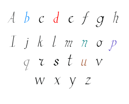
- Color Coded Version: Features a carefully curated palette where vowels, consonants, and tricky letter pairs are assigned specific hues. Vibrant and engaging, this version acts as a multisensory aid that guides readers through text at an instinctive pace.
2. Playful, Vivid Design
With rounded, bubbly letter shapes, Vivid Letters creates an inviting, friendly reading environment. Its approachable style appeals especially to children but is equally effective for learners of all ages. The playful aesthetic encourages engagement and reduces apprehension around reading tasks.
3. Strategic Use of Color for Differentiation
- Letters: Vowels might be colored in warm tones such as red or orange, while consonants take cooler shades like blue or green.
- Problematic Letter Pairs: Certain tricky pairs, such as “b” and “d,” “p” and “q,” are differentiated through contrasting colors to prevent reversals.
- Phonetic Patterns: Recognized spelling patterns and common roots can be highlighted with specific colors, reinforcing phonemic awareness.
4. Enhanced Readability and Reduced Visual Overload
The font’s generous spacing, open shapes, and high contrast reduce visual crowding—a common challenge for dyslexic readers. Consistent baseline alignment and simplified forms make scanning and decoding more natural, speeding up reading and improving comprehension.
The Power of Color Coding: How It Works
Color coding letters and words actively supports faster, easier reading by creating multisensory pathways in the brain. Here are key benefits:
- Instant Differentiation: Colors act as visual anchors, helping users quickly distinguish between similar letters and avoid common reversals.
- Pattern Recognition: Recognizing common spelling patterns and phonetic groups becomes automatic when these are consistently color-coded. This speeds up decoding and word recognition.
- Memory Aid: Colors serve as mnemonic cues, strengthening mental associations between letter shapes, sounds, and meanings.
- Reduced Fatigue: Less cognitive effort is needed to recognize words, reducing mental fatigue during extended reading sessions.
- Increased Confidence: As decoding speeds improve and errors decrease, users feel more confident, leading to greater engagement and motivation.
Applications in Education and Daily Life
- Early Literacy Development: Teachers can incorporate Vivid Letters into worksheets, flashcards, and digital content, turning learning into a multisensory, joyful experience.
- Assistive Reading Devices: Digital platforms, e-books, and apps can utilize the font to provide accessible, customizable reading environments.
- Signage and Public Information: The high-contrast Black Version supports inclusive signage in public spaces, ensuring that everyone, including those with visual or reading difficulties, can access vital information.
- Classroom and Home: Making reading materials engaging and accessible helps build confidence among struggling readers and encourages independent learning.
Supporting Actors and Script Reading
A standout application of Vivid Letters is in acting and performance arts. Script reading, rehearsals, and memorization can be stressful for actors with dyslexia or reading challenges. The color-coded font offers a game-changing tool:
- Faster Line Learning: By associating specific colors with characters, particular cues, or emotional tones, actors can quickly identify and differentiate lines, significantly reducing memorization time. The color cues serve as visual anchors, reinforcing key phrases, character cues, and tone markers, which helps actors internalize scripts more effectively.


Reviews
There are no reviews yet.