Dyslexia Topt Color Coded Font

Original price was: $5.99.Current price is: $2.99.

Dyslexia Topt Color Coded Font, an innovative typographic solution designed by Simon Blake to enhance reading speed, accuracy, and comfort for individuals with dyslexia,

Description

Dyslexia Topt Color Coded Font

(with Black Version and Color Coded Version)


Introducing the Dyslexia Topt Color Coded Font, an innovative typographic solution designed by Simon Blake to enhance reading speed, accuracy, and comfort for individuals with dyslexia, as well as to support actors and performers in reading scripts more efficiently. This unique typeface seamlessly integrates clear, bold black letterforms alongside a specially developed color-coding system, providing multisensory cues that make decoding faster, easier, and more reliable.

Why a Color Coded Font?

For many with dyslexia, traditional fonts can present obstacles that impede fluency and comprehension. These challenges include letter reversals, confusion between similar shapes, visual crowding, and cognitive overload that slow down reading and diminish confidence. Simon Blake’s innovative approach leverages the proven benefits of color coding: visual differentiation, enhanced memory, and quicker recognition, which collectively accelerate reading speed and reduce fatigue.

Features of Dyslexia Topt Font

  1. Dual Versions for Versatile Use
  • The Black Version delivers a straightforward, high-contrast font suitable for print, digital screens, signage, and general reading. Its simple but well-designed letterforms prioritize clarity and minimize visual clutter. This version is ideal for everyday reading, educational materials, and easy-to-access signage.
  • The Color Coded Version incorporates carefully selected hues for vowels, consonants, and commonly confused letter pairs. This multisensory approach guides the eye, making words pop with visual cues that help differentiate similar characters.
  1. Design for Readability and Speed
  • Clear, Bold Letterforms: The font features thick, rounded, and distinctive letter shapes that reduce ambiguity and reversals (such as “b” vs. “d” or “p” vs. “q”). Generous spacing between letters and lines minimizes visual crowding, helping the eye track smoothly across text.
  • Open Counters and Stable Baselines: Letters are designed with open internal spaces and consistent alignment, facilitating quick recognition and reducing visual fatigue—you can read longer with less strain.
  • Customizable Colors: The color palette used in the Coded Version assigns specific hues to different letter groups (e.g., vowels in red, consonants in blue). This strategic chromatic coding acts as a visual shortcut, allowing readers to rapidly differentiate and decode words.
  1. The Power of Color Coding in Reading Color coding makes a remarkable difference:
  • Speed: Visual differentiation through color allows readers to identify words and letter patterns faster, dramatically increasing reading fluency.
  • Accuracy: Colors help prevent common errors like letter reversals or misidentification by providing immediate visual cues.
  • Retention: The multisensory association of color and sound enhances memorization and recall, leading to more automatic recognition over time.
  • Confidence: When decoding becomes quicker and mistakes decrease, users develop greater confidence and enjoyment in reading.

Uses of Color Coding for Dyslexia and General Reading

  • Supporting Early Learners and Dyslexic Readers: Teachers and caregivers can incorporate the font into reading exercises, worksheets, and digital platforms to foster more effective early literacy development.
  • Enhancing Reading Fluency and Engagement: The vibrant, color-coded design motivates reluctant or struggling readers to spend more time engaging with text.
  • Community Signage and Public Materials: State and local authorities can utilize the font to create more accessible signage and information displays, making public spaces more inclusive.
  • Digital and Print Media: Publishers of textbooks, e-books, websites, and educational tools can adopt the font to make content more accessible and efficient to read.

Special Application for Actors and Reading Scripts

One of the most innovative applications of the Dyslexia Topt Font is its utility for actors, performers, and anyone reading scripts or dialogue-heavy content. Script reading often involves quick memorization, accurate line delivery, and understanding of cues—all of which demand fast, clear reading under pressure.

  • Supporting Actors with Dyslexia: Many actors and performers face challenges similar to learners, especially when dissecting complex scripts with small print, dense dialogues, or tight rehearsal schedules. The color-coded letter groups serve as visual anchors, helping actors decode scripts rapidly without confusion, even under stressful conditions.
  • Faster Script Learning: The color cues act as mnemonic aids, reinforcing character names, cues, and key lines. This multisensory support enables actors to memorize lines more quickly, reducing rehearsal time and anxiety.
  • Enhanced Focus and Reduced Fatigue: Script pages with the font reduce visual strain, helping actors stay focused longer during rehearsals or performances. The clear differentiation of key words or phrases via contrasting colors highlights cues and emotional points, aiding delivery.

Supporting actors with dyslexia and scripts:
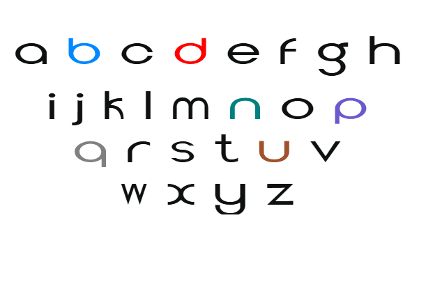
Many actors, especially those with dyslexia, find reading scripts under time constraints or during high-pressure performances particularly challenging. Small print, closely packed dialogue, and dense stage directions can cause confusion, slow down rehearsal times, and increase stress. The Dyslexia Topt Color Coded Font offers an innovative solution: by providing visual differentiation through color cues, it helps actors quickly recognize character names, cues, and key lines, all while reducing visual fatigue and cognitive load.

Accelerating memorization and rehearsals:
The color cues act as mnemonic aids—associating specific colors with certain characters, emotions, or cues—making it easier for actors to recall their lines and cues swiftly. This multisensory approach supports faster memorization, boosting confidence and performance quality. Actors can focus more on expression and delivery, knowing that the font’s visual support aids decoding even in complex or lengthy scripts.

Enhancing focus and reducing stress:
Rehearsals often demand extended reading and line learning, which can be tiring for dyslexic performers. The clear, distinct letterforms and strategic color differentiation reduce visual clutter, helping actors stay engaged longer without fatigue. Highlighted cues and key phrases allow for quicker navigation through scripts, minimizing the stress of misreading or forgetting lines during live performances.

Practical Benefits for Theatre and Media:

  • Efficient rehearsal time: Faster line learning and cue recognition reduce overall rehearsal schedules.
  • Increased confidence: Less confusion and errors lead to a more natural, confident performance.
  • Accessible script materials: The font supports inclusive casting, allowing actors with dyslexia to participate fully and showcase their talent without unnecessary barriers.
  • Digital scripting tools: The font can be integrated into digital script files, apps, and teleprompters, making real-time reading and cue recognition easier for performers of all abilities.

In Summary:
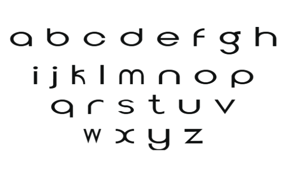
The Dyslexia Topt Color Coded Font by Simon Blake is a groundbreaking typographic innovation that combines visual clarity with multisensory support. Its dual versions—classic Black and vibrant Color Coded—serve diverse needs, from everyday reading to specialized applications like acting scripts. The power of color coding transforms ordinary text into an accessible, efficient tool, drastically increasing reading speed and accuracy.

For learners, this font accelerates literacy development by reducing decoding time and promoting confidence. For actors and performers, it reduces the stress of script reading, enhances recall, and fosters more natural performances. As a result, the Dyslexia Topt Font embodies a new approach to typography—one that recognizes diverse cognitive profiles and strives to make reading not just easier, but more inclusive and empowering for everyone.

Reviews

There are no reviews yet.

Be the first to review “Dyslexia Topt Color Coded Font”

Your email address will not be published. Required fields are marked *