Dyslexia Crufty Color Font with Black Version by Simon Blake
(with Black Version and Color Coded Version)
Introducing Dyslexia Crufty Color Font, a revolutionary typeface crafted by Simon Blake with a mission to make reading faster, easier, and more accessible for individuals with dyslexia. Combining bold, rounded, and approachable letterforms with innovative color coding techniques, this font aims to eliminate common reading barriers and foster confidence in learners of all ages.
Versatile and Inclusive Design
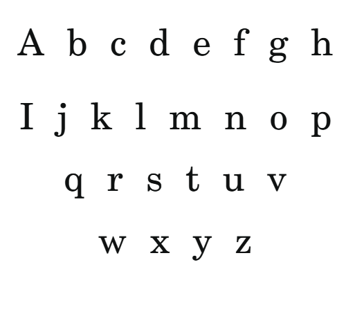
The Dyslexia Crufty Font comes in two powerful variations: the Black Version and the Color Coded Version. The Black Version features a clean, high-contrast design ideal for print, digital media, and environments where visual clarity is paramount. It ensures maximum readability with its bold, smooth, and distinguishable letterforms and generous spacing, reducing visual clutter and minimizing fatigue.
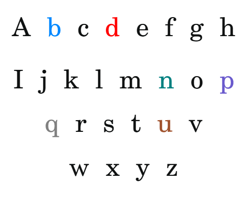
The Color Coded Version introduces a multisensory approach by strategically applying specific colors to different letter groups. This version is designed for educational use, reading programs, and digital platforms that benefit from visual cues. The color coding acts as a guide, helping readers differentiate similar-looking letters, decode words more rapidly, and retain information more effectively.
How Color Coding Enhances Reading Speed and Ease
Color coding letters in fonts is a proven technique to support faster, more efficient reading, especially for dyslexic individuals. Here’s how it works and why it’s so effective:
1. Immediate Visual Differentiation
By assigning unique colors to vowels, consonants, or individually confusing letter pairs (such as “b” and “d,” “p” and “q”), the font creates visual anchors. These cues help the brain quickly recognize and distinguish between similar symbols, drastically reducing the time spent deciphering each letter and decreasing errors caused by reversals or substitutions.
2. Reduced Visual Confusion and Crowding
Letters that look alike or tend to blend together (called crowding effects) are a common challenge for dyslexic readers. Color coding separates these similar shapes visually, breaking the “visual noise,” and allowing the eye to process each letter as a distinct entity. This separation makes words clearer and less overwhelming, facilitating smoother word recognition.
3. Faster Decoding and Word Recognition
When the brain isn’t bogged down trying to identify every letter with effort, it can focus on recognizing whole words and understanding context more quickly. Color cues act as a shortcut, accelerating decoding speed and improving fluency. This leads to a natural, effortless reading flow, boosting confidence and motivation.
4. Reinforcement of Learning and Memory
Colors serve as multisensory anchors, reinforcing the connection between letter shapes, sounds, and word meanings. Over time, with repeated exposure to color-coded cues, readers develop stronger mental associations, which translate into faster reading and better retention.
5. Increased Confidence and Engagement
Reading with color cues is more engaging and less intimidating. The visual stimulation encourages learners to read more often, practice longer, and enjoy the process rather than feel frustrated or overwhelmed.
Practical Uses and Applications
Educational Tools: The Color Coded Version is ideal for early learners and students with reading difficulties. Teachers can incorporate this font into worksheets, digital reading apps, and classroom materials to support multisensory learning approaches.
Digital Content and Websites: Using the font on websites, e-books, or apps can improve online reading experiences for dyslexic users, encouraging independent navigation and greater accessibility.
Printed Materials and Publishing: The Black Version offers a clear, accessible option for printed textbooks, labels, signage, and other printed media, making information more accessible in everyday environments.
Assistive Technologies: The font seamlessly integrates with text-to-speech apps, screen readers, and custom digital platforms that allow personalized adjustment of font and color schemes, further enhancing usability.
Why Choose the Dyslexia Crufty Font?
Design for Accessibility: The bold, rounded, and uniquely shaped letterforms are crafted specifically to reduce confusion, reversals, and visual stress—common obstacles for dyslexic readers.
Color Coding for Faster Reading: The strategic use of color guides the eye, reduces decoding time, and promotes faster reading, which is crucial in academic, professional, and everyday settings.
Flexibility and Adaptability: Whether you need a straightforward font for print (Black Version) or a multisensory, color-coded tool (Color Version), this font adapts to your needs, creating an inclusive reading environment.
Empowering Learning and Confidence: By making reading less strenuous, more engaging, and visually supportive, the Dyslexia Crufty Font helps build confidence, foster independence, and unlock the potential in every learner.


Reviews
There are no reviews yet.