Dyslexia Chancery Color Font by Simon Blake
The Dyslexia Chancery Color Font, designed by Simon Blake, represents a pioneering approach to accessible typography tailored for individuals with dyslexia. It combines the timeless elegance of traditional chancery script with innovative color coding techniques, creating a font that is not only aesthetically pleasing but also functionally supportive of neurodiverse readers. By integrating carefully curated color schemes within a familiar, historical calligraphic style, this font aims to improve reading fluency, comprehension, and confidence—especially for learners and readers struggling with conventional fonts.
Introduction to Dyslexia Chancery Color
The Dyslexia Chancery Color Font stands out as a unique synthesis of classic calligraphy and modern accessibility features. Recognizing the vital importance of visual cues in reading, Simon Blake incorporates layered color coding directly into the letterforms. This multisensory design reinforces recognition, reduces confusion, and boosts reading speed for individuals with dyslexia. The font achieves an elegant, historic appearance while embedding features that support comprehension and decoding, making reading a more engaging and less daunting experience.
Key Features of the Dyslexia Chancery Color Font
1. Elegant Chancery Style with Clear Letterforms
While embracing the artistry of historical chancery scripts—with its flowing, cursive-like lines—the font simplifies complex flourishes and maintains open, distinguishable letter shapes. These adjustments preserve the aesthetic appeal of traditional calligraphy while prioritizing clarity and readability. The balanced stroke contrast and deliberate letter spacing reduce visual clutter, helping readers easily follow lines of text.
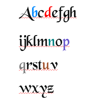
2. Other Strategic Color Coding for Letter Differentiation Ideas.
The signature feature of this font is its integrated use of color within letterforms. Each letter or group of related letters is assigned a specific, thoughtfully selected color. For example:
- Vowels like “A,” “E,” “I,” “O,” and “U” may be in warm, bright tones such as red, orange, or yellow.
- Consonants could be in cooler shades like blue, green, or purple.
- Commonly confused letter pairs (e.g., “b” vs. “d” or “p” vs. “q”) are color-coded to help distinguish between them rapidly.
This system enhances visual discrimination, allowing the brain to associate specific colors with letter sounds and shapes. Such multi-layered cues aid in decoding, recognition, and retention—key components in overcoming reading difficulties.
3. Open, Distinct Letterforms and Increased Spacing
The font design emphasizes open counters and generous spacing to prevent crowding effects, which often hinder dyslexic readers. The open shapes of the letters facilitate quicker identification, while increased spacing between words and characters reduces visual confusion and tracking issues, resulting in smoother, more confident reading.
4. Versatile Range of Weights and Styles
Offering multiple weights—such as Regular, Bold, and Light—the Dyslexia Chancery Color Font can adapt to diverse applications, from body text to headings, signage, or digital interfaces. The versatility ensures consistency and accessibility across platforms, whether in educational materials, websites, or printed books.
5. Compatibility with Background Colors and Customization
The color coding system is designed for flexibility; backgrounds can be adjusted to optimize contrast and reduce visual strain. Users or designers can customize color schemes to suit individual preferences or specific environmental needs, promoting comfort and accessibility for a broad spectrum of users.
How Color Coding Enhances Reading Capabilities
The incorporation of color into the font plays a pivotal role in supporting dyslexic readers by addressing core challenges in decoding and recognition:
1. Improved Letter and Word Recognition
Color acts as an immediate visual cue that helps differentiate letters and words, especially those with similar shapes or that are commonly mixed up. For example, the color distinctions between “b” and “d” minimize reversal errors, a frequent difficulty among dyslexic readers. This visual reinforcement accelerates letter recognition, leading to faster decoding and increased fluency.
2. Reduced Visual Confusion and Crowding
Crowding—where letters appear to blend or overlap—can significantly impede reading. Open letterforms combined with color distinctions reduce these effects, making individual characters stand out clearly against the background. This creates a more comfortable reading environment and reduces frustration.
3. Enhanced Memory and Learning
Color coding reinforces the association between letter shapes and sounds, supporting memory retention and retrieval. When learners encounter a specific color pattern associated with a sound or letter group, it aids in the internalization of that information, leading to more automatic recognition over time.
4. Increased Confidence and Motivation
Engaging, colorful text can make reading less intimidating and more stimulating. When readers see familiar or predictable color-coding cues, they experience a boost in motivation and confidence, which encourages sustained reading practice. This positive reinforcement is vital for developing literacy skills and fostering independence.


Reviews
There are no reviews yet.