Dyslexia Liberation Sans Family Color Font by Simon Blake
The Dyslexia Liberation Sans Family Color Font, crafted by Simon Blake, represents a transformative step forward in inclusive typography designed specifically to aid individuals with dyslexia. Combining modern sans-serif aesthetics with scientifically-informed color coding, this font family aims to break down barriers to reading, making text more accessible, engaging, and less frustrating for neurodiverse readers. Whether used in digital interfaces, print media, educational resources, or assistive tools, Dyslexia Liberation Sans offers a versatile, user-centered solution rooted in research and real-world application.
Introduction to Dyslexia Liberation Sans
The Dyslexia Liberation Sans Family is a thoughtfully designed typeface series that emphasizes simplicity, clarity, and differentiation. Its clean, contemporary lines reduce visual clutter, help maintain focus, and improve legibility for those with dyslexia. The font’s characteristics—such as well-spaced letters, open forms, and distinct shapes—are engineered to minimize common reading errors like letter reversals and crowding. This is achieved through subtle yet impactful modifications, improving reading fluency and comprehension.
What sets this font apart is the integration of color coding, an innovative feature inspired by educational strategies and cognitive science research. The purpose is to provide visual cues that guide the reader’s eye, enhance letter and word recognition, and foster independence and confidence in reading.
Key Features of the Dyslexia Liberation Sans Family
1. Modern Sans-Serif Design for Clarity and Simplicity
The font features a sleek sans-serif design with smooth, uncomplicated character shapes. Its minimalistic style reduces extraneous visual information, allowing the reader to focus on the text itself. The clean lines facilitate faster recognition and reduce cognitive load, enabling quicker decoding and smoother reading flow.
2. Distinctive Letter Differentiation
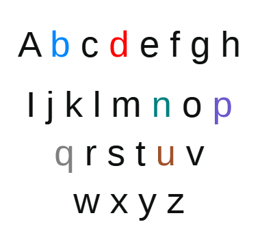
Building upon principles of dyslexia-friendly typography, the font includes subtle shape modifications to differentiate commonly confused letters such as “b”, “d”, “p”, and “q”. These differences are crucial in reducing reversals and mixing up similar characters, which are frequent hurdles for dyslexic readers. The wide spacing and open counters further support letter identification by offering clear visual separation.
3. Color Coding Integration
The pivotal feature of the Dyslexia Liberation Sans Family is its systematic use of color to support reading. Each letter, or more commonly, specific groups of letters (such as vowels, consonants, or frequently confused pairs), is assigned a designated color. This multisensory approach leverages visual cues to assist recognition, decoding, and retention.
For example:
- Vowels might be highlighted in warm tones like red, orange, or yellow.
- Consonants could be in cooler shades such as blue or green.
- Common letter pairs or confusing letter groups are color-coded to aid discrimination.
This color coding serves multiple purposes:
- Helps readers distinguish similar-looking letters visually.
- Supports memory recall for letter and word recognition.
- Reduces visual stress and improves focus during reading tasks.
- Provides a multisensory learning experience that engages visual and cognitive pathways.
4. High-Contrast and Adjustable Color Schemes
The font family is compatible with various background and text color combinations, offering flexibility for different readers’ needs. The color assignments are chosen to maximize contrast while remaining comfortable for prolonged reading sessions. Users can adapt the palette or create custom color schemes that suit personal preferences or reading environments.
5. Increased Letter and Word Spacing
Enhanced spacing practices help reduce crowding effects, which are common difficulty points in dyslexia. Larger spacing between letters and words improves tracking, reduces visual confusion, and supports easier decoding.
6. Multiple Weights and Styles for Versatility
The Dyslexia Liberation Sans Family includes various font weights—from Light to Bold—providing versatility across different applications such as headings, body text, or emphasis. This flexibility ensures consistency in reading support across multiple media formats.
How Color Coding Enhances Reading Capabilities
The core innovation of the Dyslexia Liberation Sans Family lies in how color transforms the reading experience, especially for those with dyslexia. Here’s how:
1. Improved Letter Differentiation
Colors act as visual anchors, helping readers quickly differentiate between similar letters. This reduces the tendency to confuse “b” with “d” or “p” with “q,” which are common stumbling blocks. When these letters are associated with distinct colors, the brain more readily encodes and retrieves their identities.
2. Increased Reading Speed and Fluency
Color cues facilitate faster decoding by providing additional context. When a reader recognizes a letter’s color pattern, decoding becomes more automatic, leading to improved reading fluency. This leads to less strain, greater confidence, and a more positive reading experience.


Reviews
There are no reviews yet.